SCI常见的18种配图代码实现
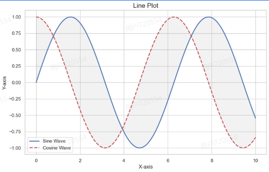
1. 折线图
|
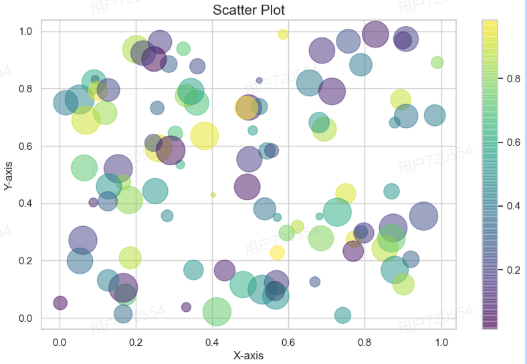
2. 散点图
|
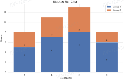
3. 条形图
|
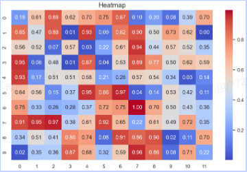
4. 热力图
|
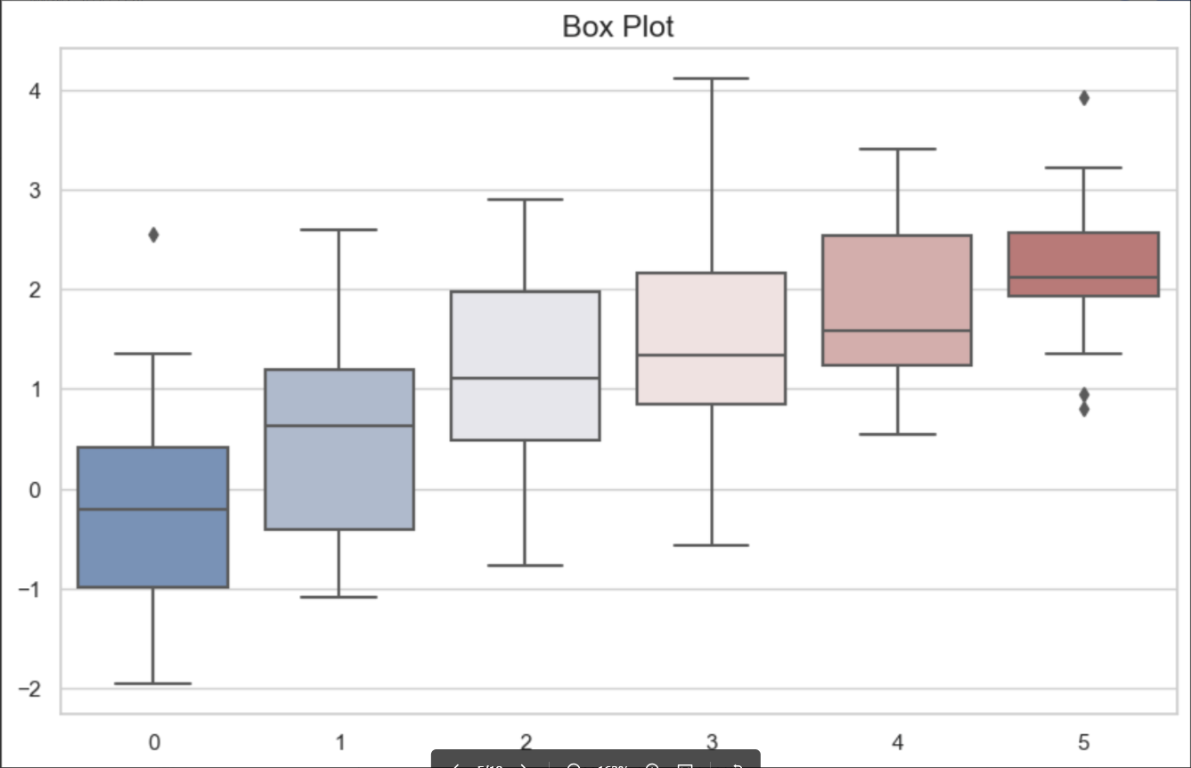
5. 箱线图
|
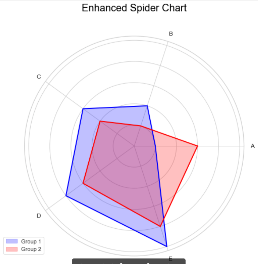
6. 蜘蛛图
|
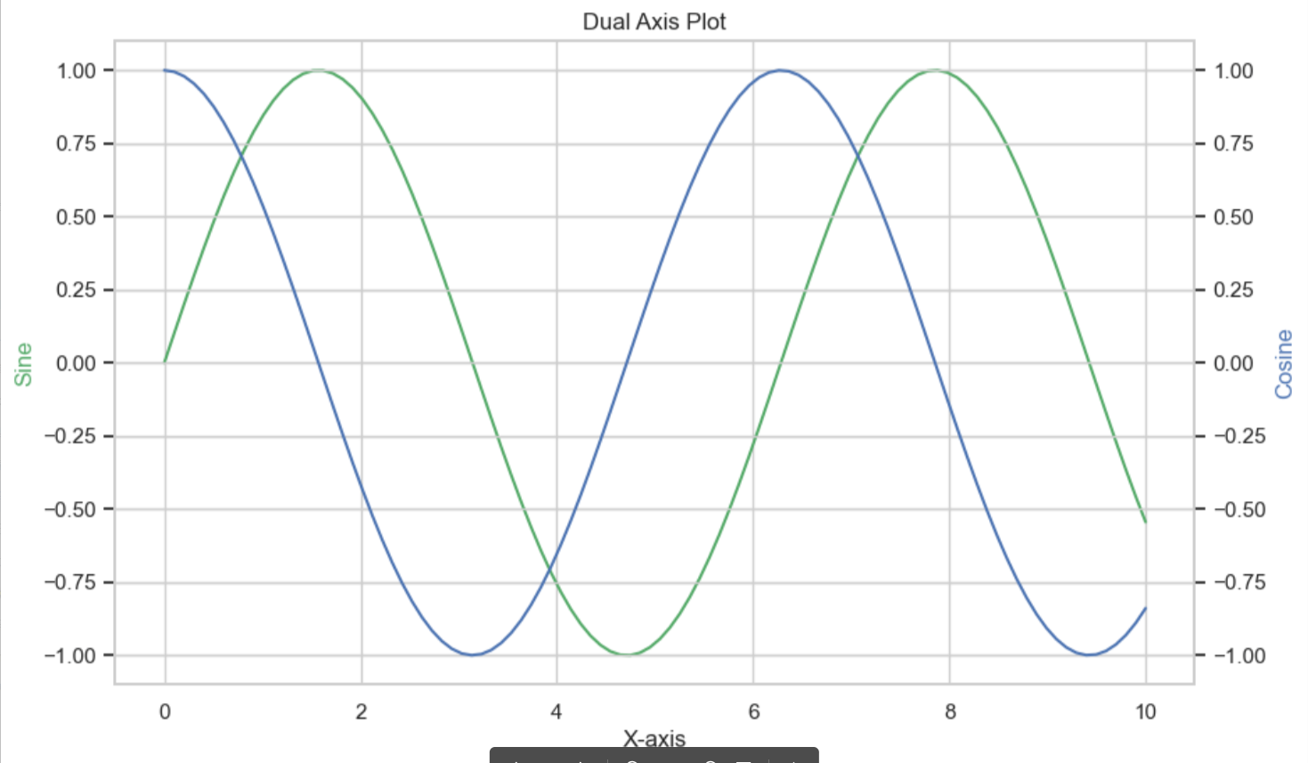
7. 双轴图
|
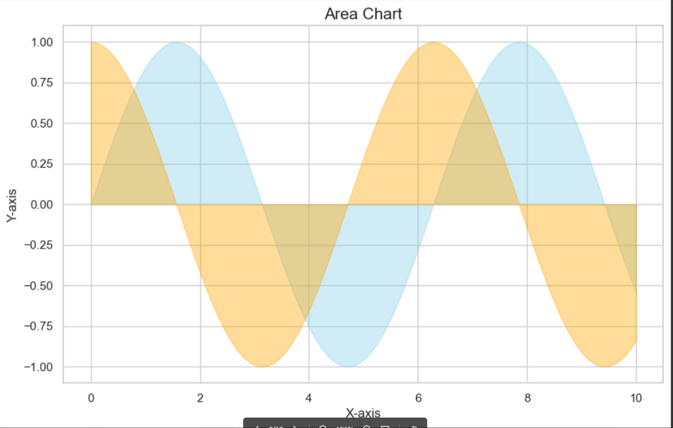
8. 面积图
|
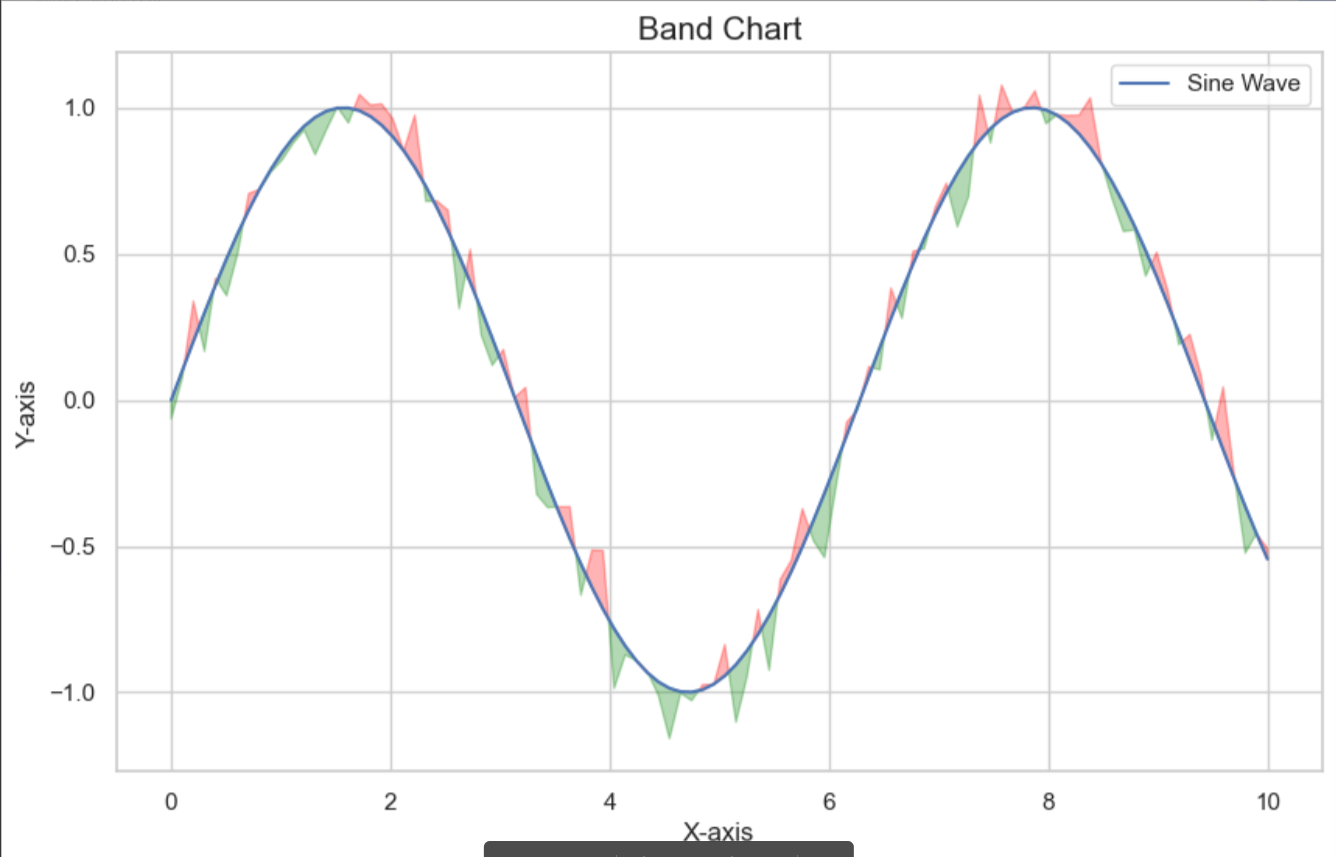
9. 带状图
|
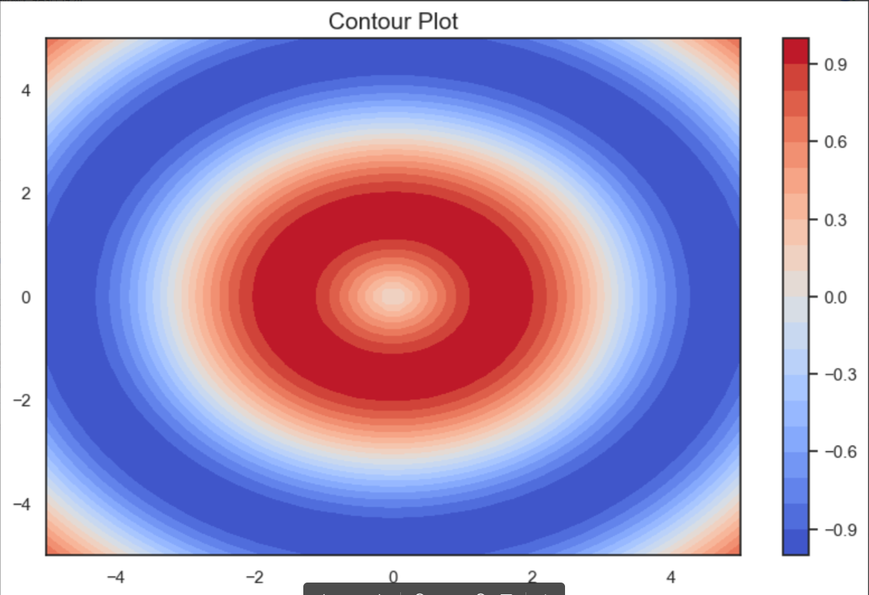
10. 等高线图
|
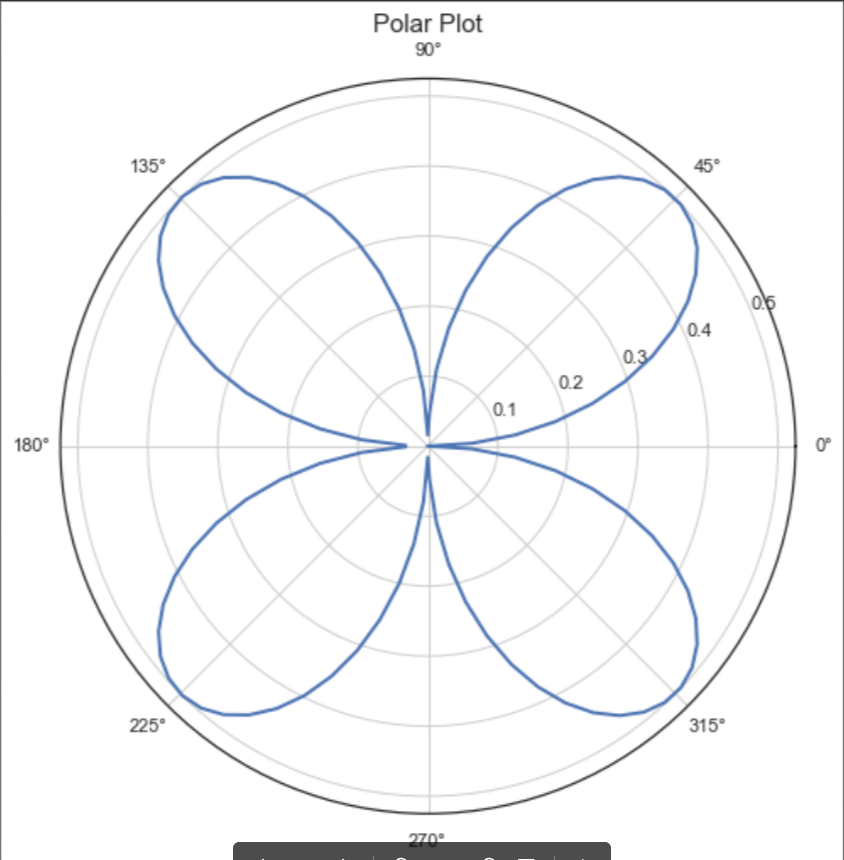
11. 极坐标图
|
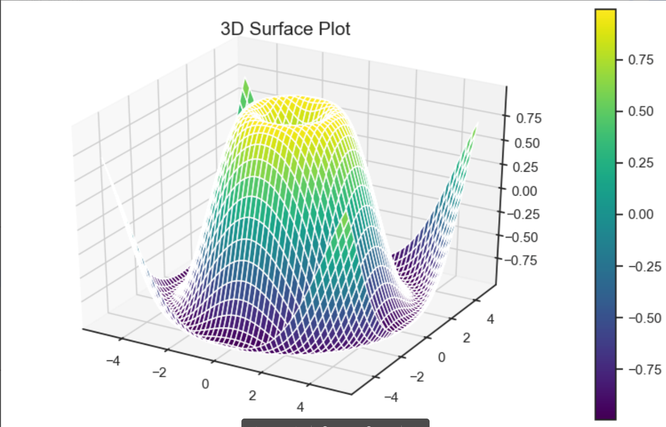
12. 3D曲面图
|
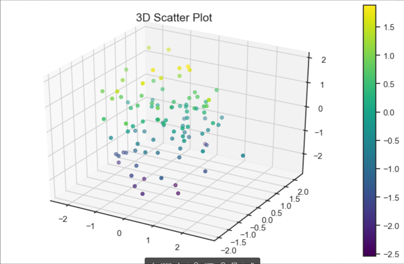
13. 3D散点图
|
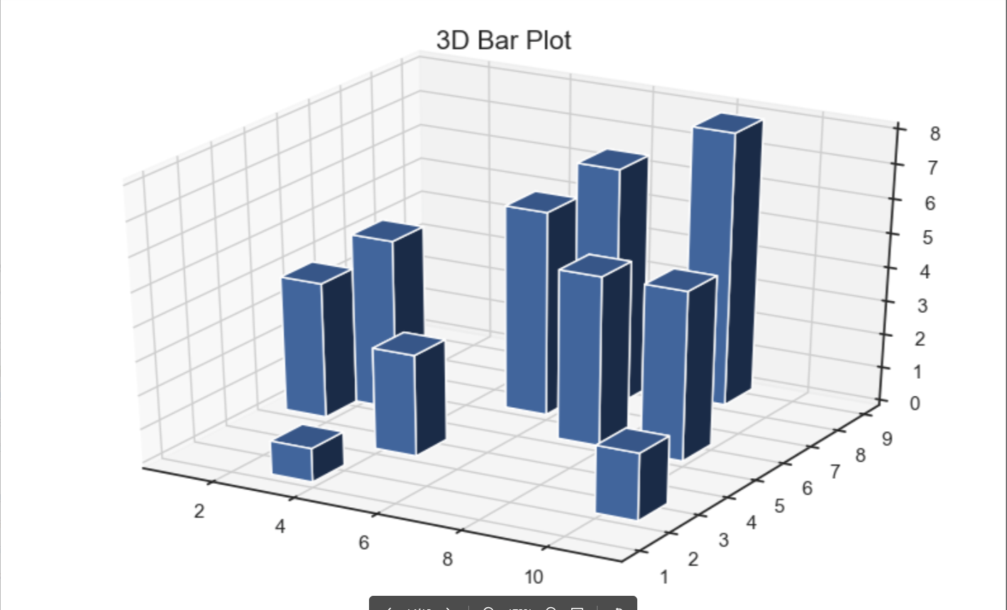
14. 3D条形图
|
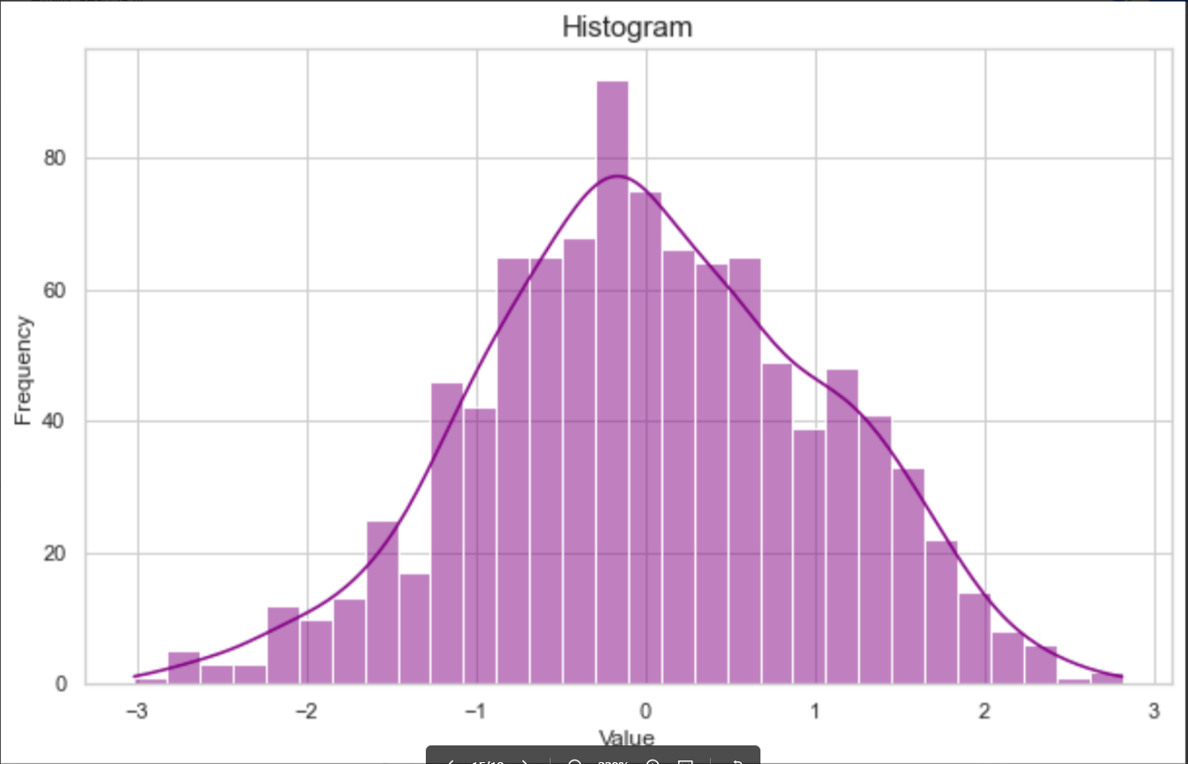
15. 直方图
|
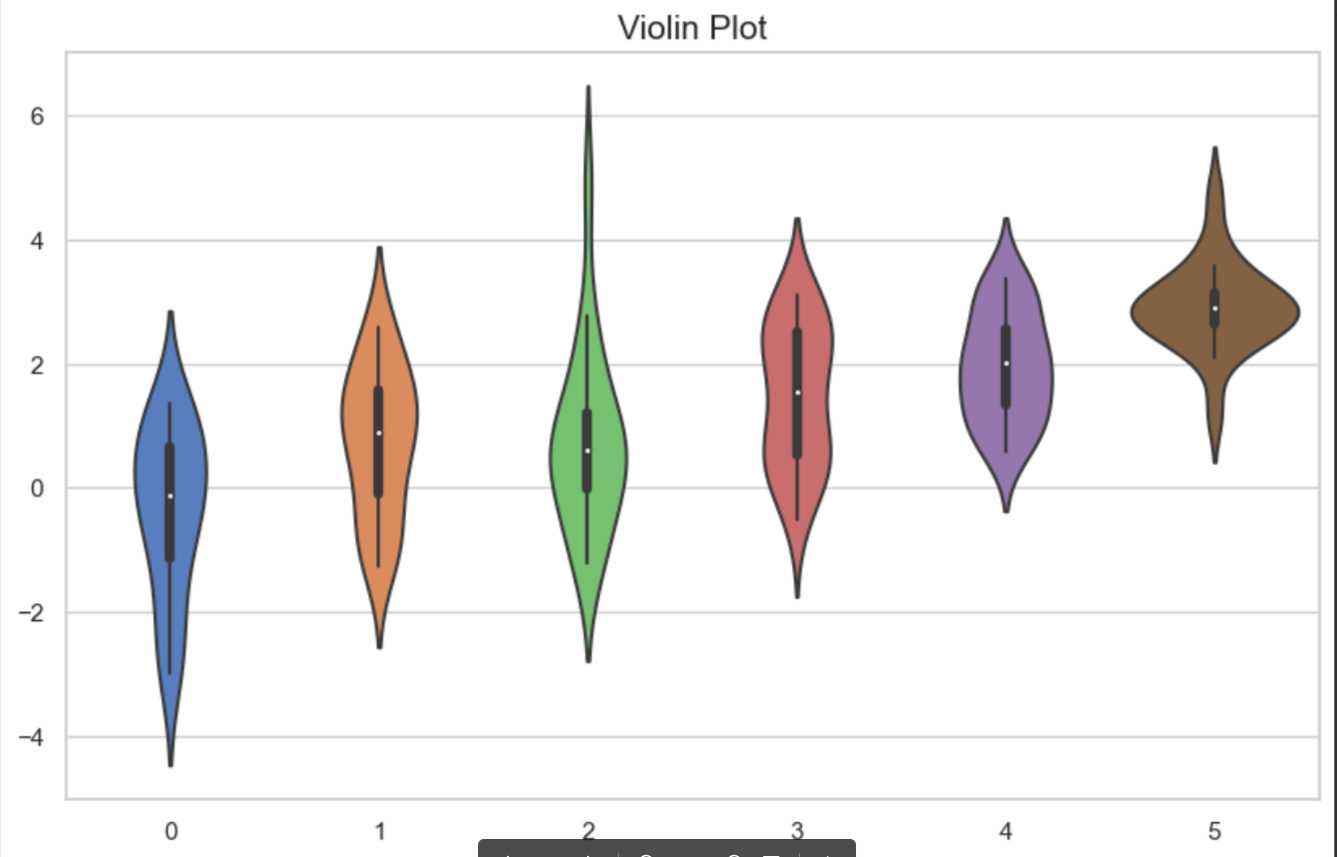
16. 小提琴图
|
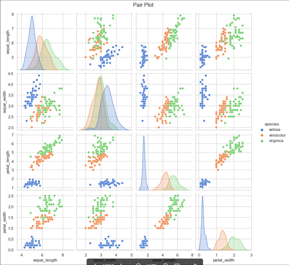
17. 成对关系图
|
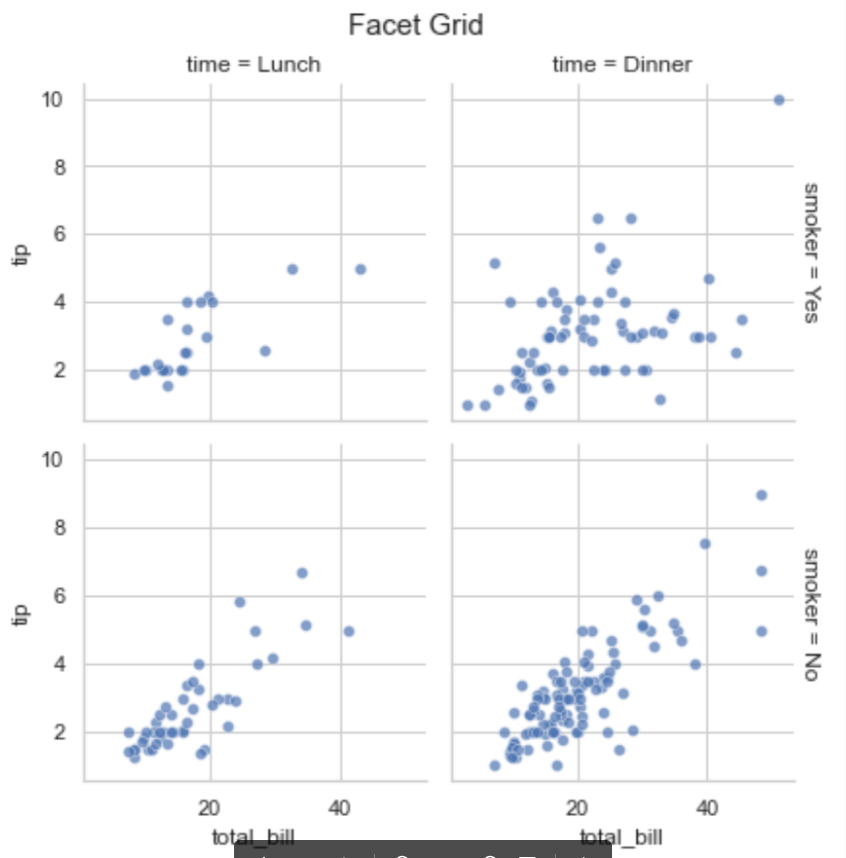
18. 18.Facet Grid 图
|
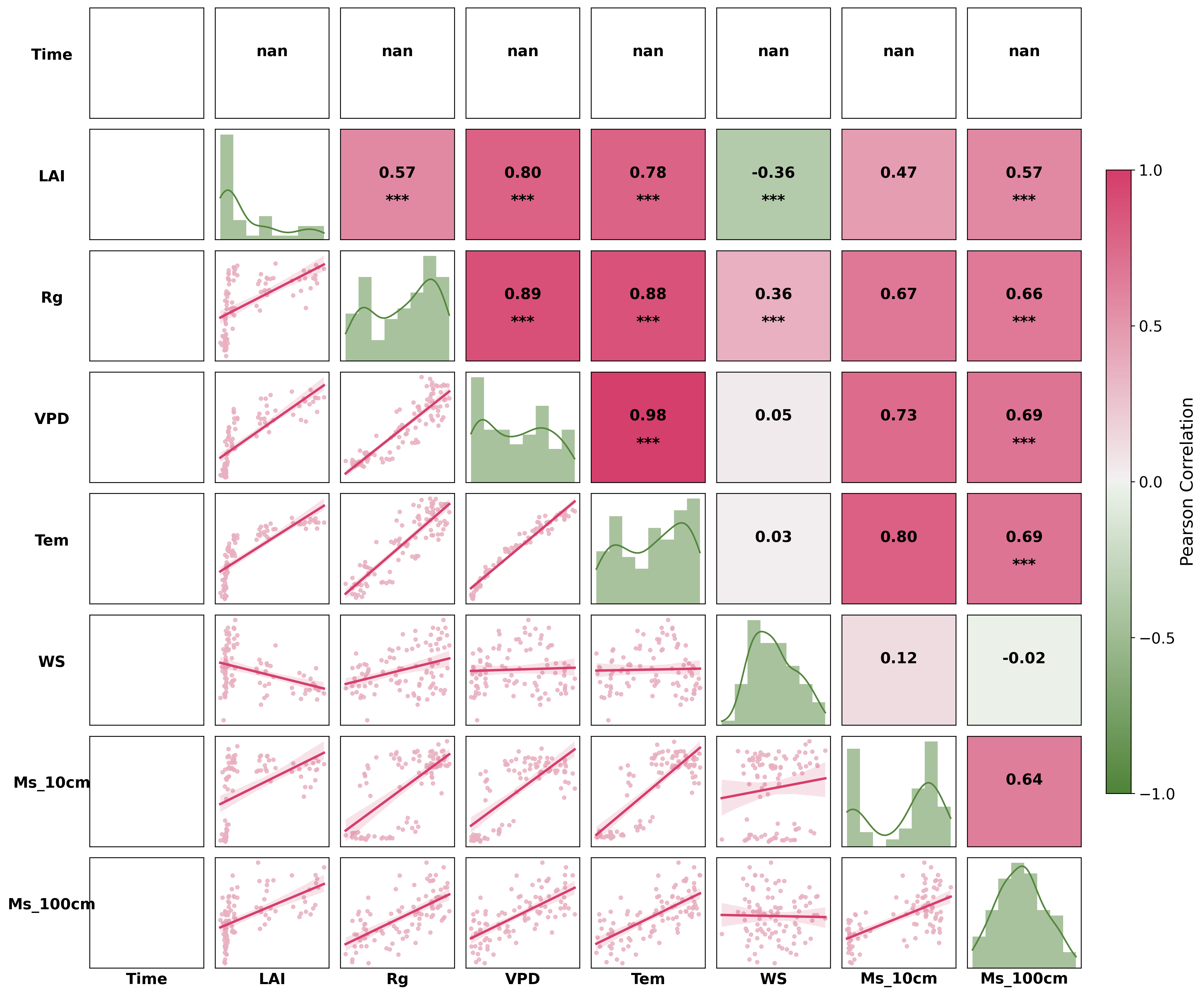
19. 热力图plus
19.1. 普通热图
19.1.1. 正方形
|
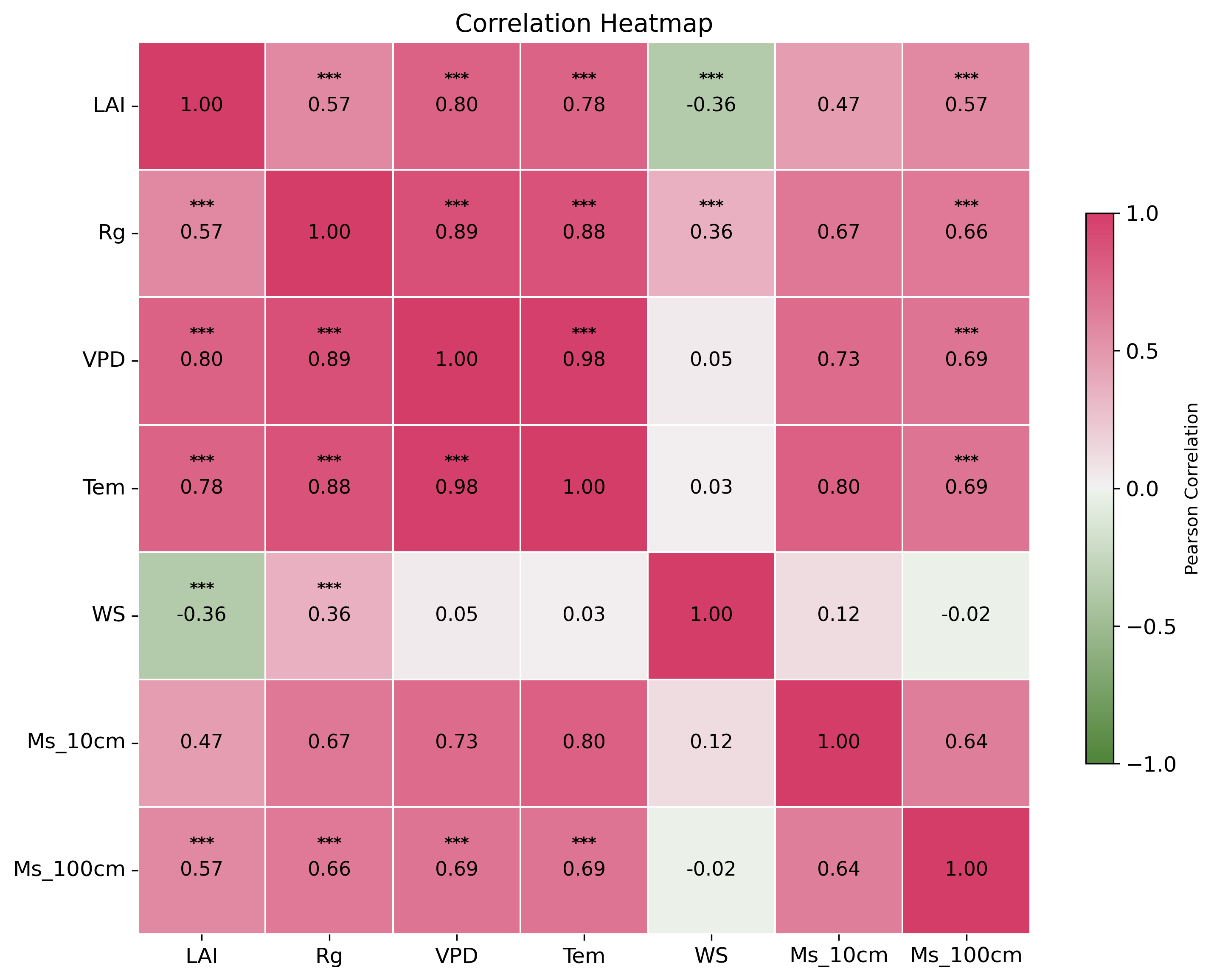
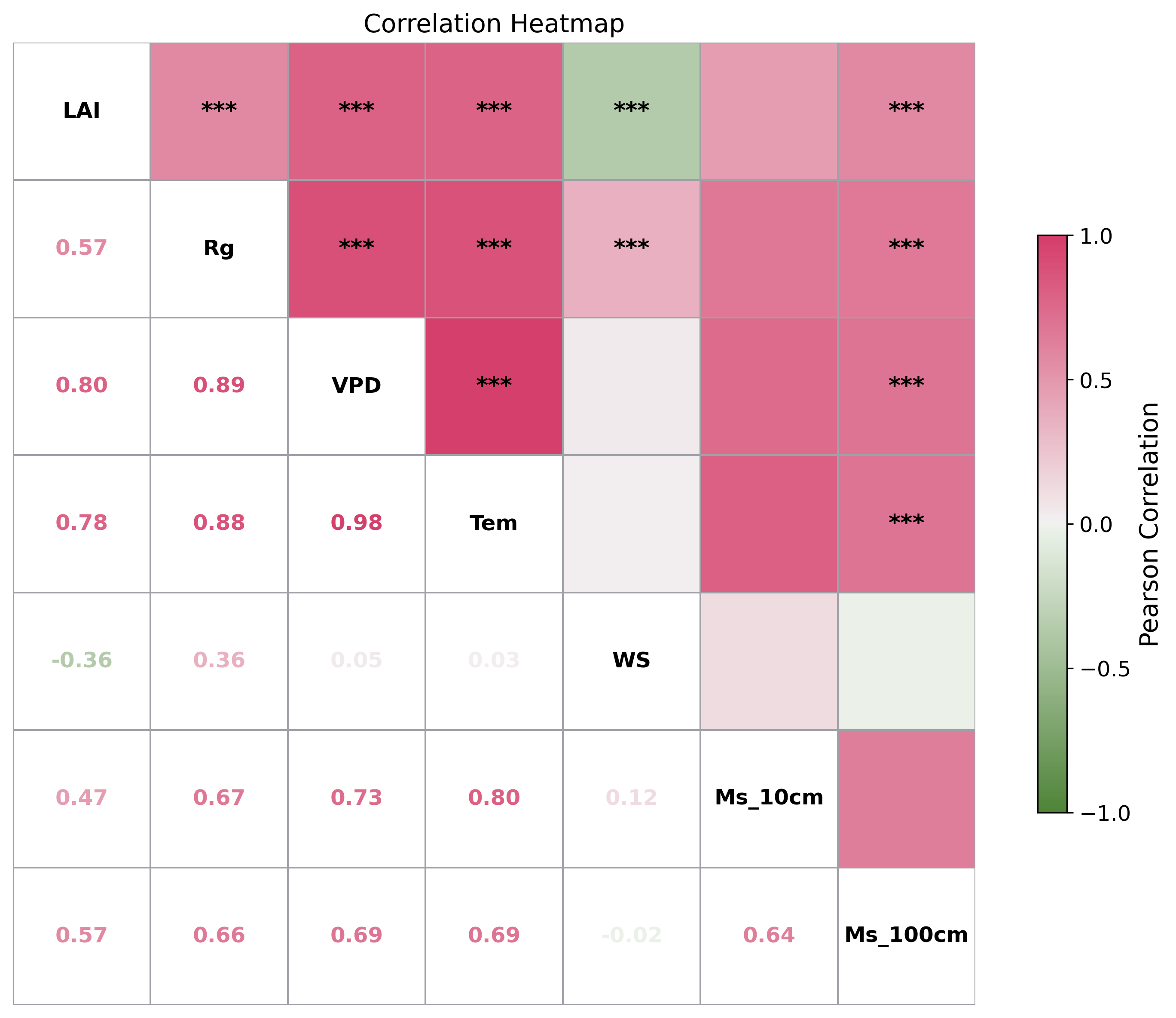
19.2. 上方块显著性下系数
|
19.3. 气泡热力图(方块)
|

19.3.1. 2.保留上三角/下三角
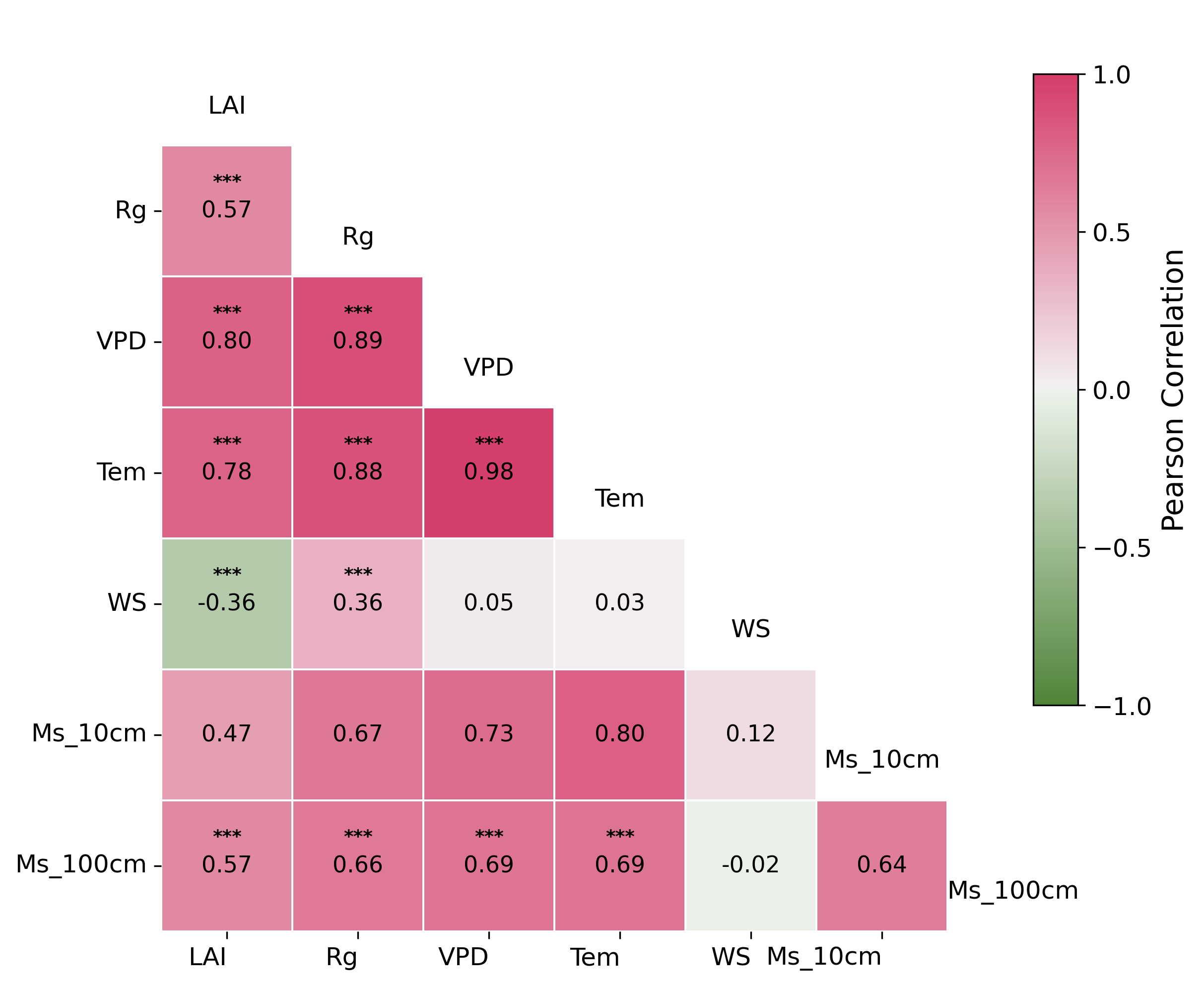
19.4. 下三角
|
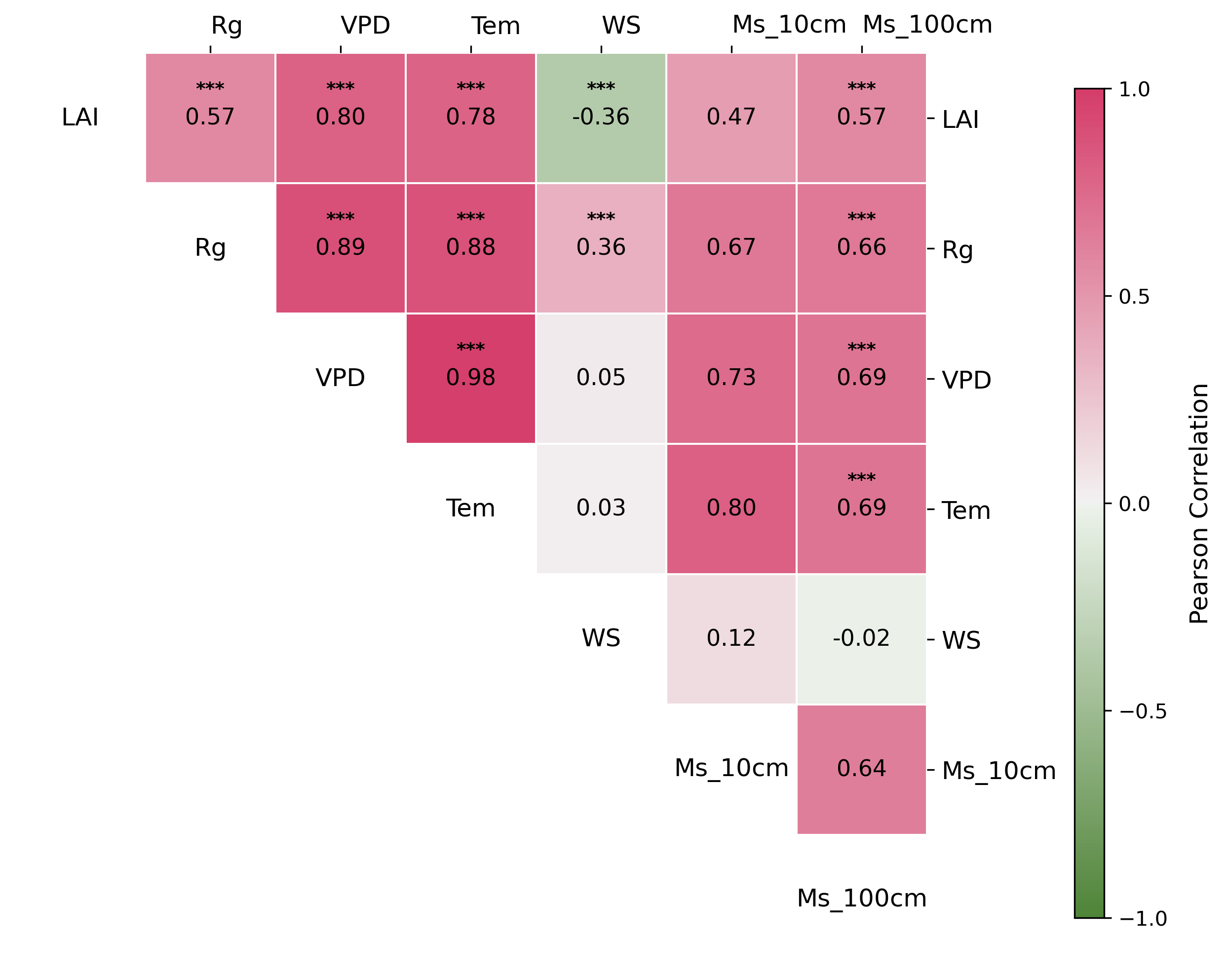
19.5. 上三角
|
19.6. 圆形
|
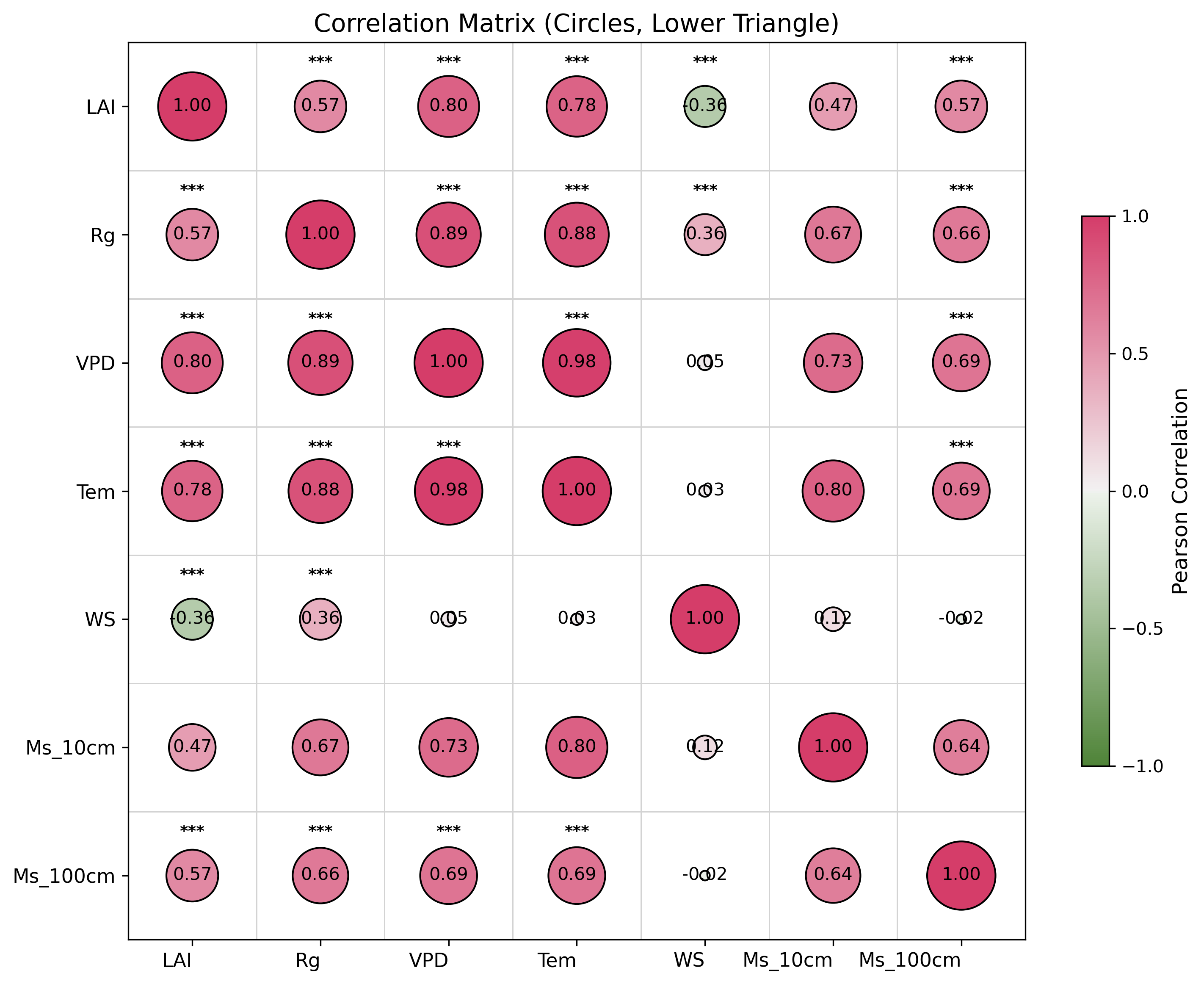
import pandas as pd
import seaborn as sns
import matplotlib.pyplot as plt
import scipy.stats as stats
import numpy as np
import os

# === 第一步:读取 Excel 文件 ===
file_path = "data.xlsx"
xls = pd.ExcelFile(file_path, engine="openpyxl")
df = xls.parse("Sheet1")
# === 清洗数据:去除字符串中的空格并尝试转换为数值 ===
for col in df.columns:
    df[col] = pd.to_numeric(df[col].astype(str).str.strip(), errors='coerce')

numeric_df = df.drop(columns=["Time"])  # 如无 "Time" 列请注释此行

# === 第二步:计算相关系数和 p 值 ===
cols = numeric_df.columns
corr_matrix = numeric_df.corr()
pval_matrix = pd.DataFrame(np.ones_like(corr_matrix), columns=cols, index=cols)

for i in range(len(cols)):
    for j in range(len(cols)):
        if i != j:
            corr, p = stats.pearsonr(numeric_df[cols[i]], numeric_df[cols[j]])
            pval_matrix.iloc[i, j] = p

# === 第三步:绘图(不使用 annot,而是手动 text)===
fig, ax = plt.subplots(figsize=(10, 8),dpi = 300)
cmap = sns.diverging_palette(120, 0, as_cmap=True)
# cmap = plt.get_cmap('coolwarm')
norm = plt.Normalize(vmin=-1, vmax=1)

# === 只显示白色方格和灰色边框 ===
sns.heatmap(
    np.ones_like(corr_matrix),  # 全1,配合白色cmap
    cmap='Greys',
    linewidths=1,
    linecolor='grey',
    vmin=1, vmax=1,  # 保证格子为白色
    square=True,
    cbar=False,
    ax=ax
)

# === 添加气泡 ===
for i in range(len(cols)):
    for j in range(len(cols)):
        corr_val = corr_matrix.iloc[i, j]
        # 只在上三角画气泡
        if not np.isnan(corr_val) and i < j:
            size = 800 * abs(corr_val)
            color = cmap(norm(corr_val))
            ax.scatter(j + 0.5, i + 0.5, s=size, color=color, alpha=0.8, edgecolors='grey', linewidth=0.5, zorder=3)

sm = plt.cm.ScalarMappable(cmap=cmap, norm=norm)
sm.set_array([])
cbar = fig.colorbar(sm, ax=ax, shrink=0.6, aspect=20, ticks=[-1, -0.5, 0, 0.5, 1])
cbar.set_label("Pearson Correlation", fontsize=14)
cbar.ax.tick_params(labelsize=12)

# === 手动添加文本 ===
for i in range(len(cols)):
    for j in range(len(cols)):
        corr_val = corr_matrix.iloc[i, j]
        p = pval_matrix.iloc[i, j]
        # 上三角(右上角):显著性星号
        if i < j:
            star = ""
            if p < 0.001:
                star = "***"
            elif p < 0.01:
                star = "**"
            elif p < 0.05:
                star = "*"
            if star:
                ax.text(j + 0.5, i + 0.5, star, ha='center', va='center', color='black', fontsize=13, fontweight='bold', zorder=4)
        # 下三角(左下角):相关系数,颜色与色条对应
        elif i > j:
            color = cmap(norm(corr_val)) if not np.isnan(corr_val) else 'black'
            ax.text(j + 0.5, i + 0.5, f"{corr_val:.2f}", ha='center', va='center', color=color, fontsize=12, fontweight='bold', zorder=4)
        # 对角线:显示变量名
        elif i == j:
            ax.text(j + 0.5, i + 0.5, cols[i], ha='center', va='center', fontsize=12, color='black', fontweight='bold', zorder=4)

# === 隐藏xy轴刻度和label ===
ax.set_xticks([])
ax.set_yticks([])
ax.set_xticklabels([])
ax.set_yticklabels([])
ax.set_xlabel('')
ax.set_ylabel('')
ax.xaxis.set_ticks_position('none')
ax.yaxis.set_ticks_position('none')
plt.title("Correlation Bubble Heatmap", fontsize=14)
plt.tight_layout()
plt.show()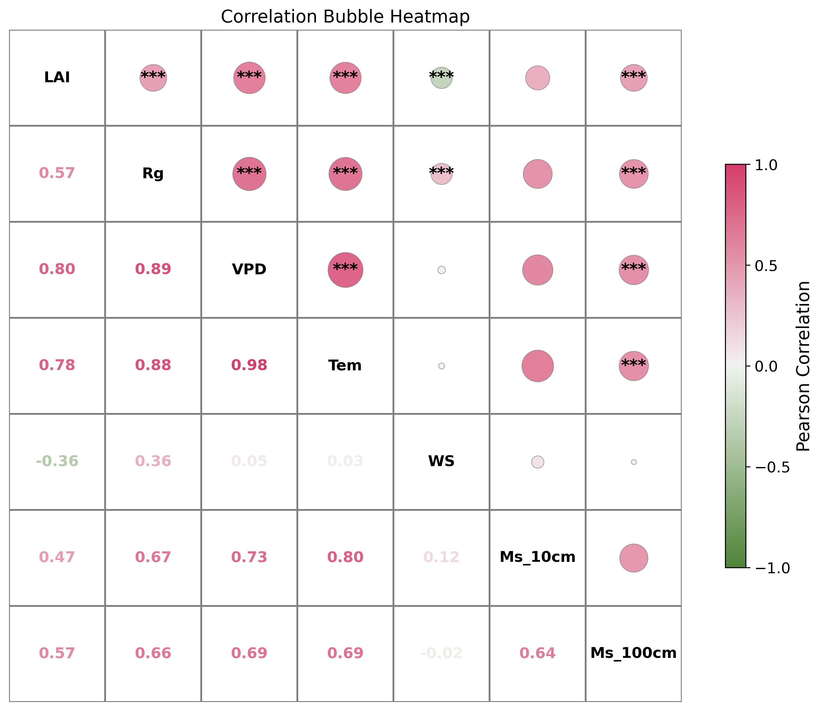
20. 统计图散点图plus
|